It’s a busy Saturday (Go VT Hokies!) and I’ll be taking lots of wedding reception shots in a couple hours … so why not a couple of the trestle first?

(anyone get the title’s take off on Donnie and Marie?)

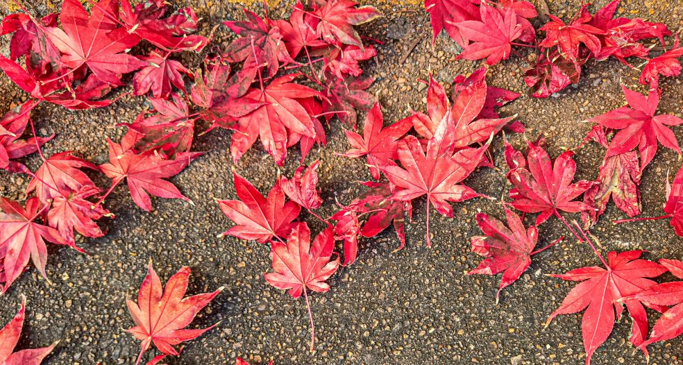
Which do you like better?
It’s a busy Saturday (Go VT Hokies!) and I’ll be taking lots of wedding reception shots in a couple hours … so why not a couple of the trestle first?
(anyone get the title’s take off on Donnie and Marie?)
Which do you like better?

You are dating yourself LB but thats OK, I’m a little bit country ! I love black and white and your photo is no exception but, the way the backlighting is highlighting the leaves I think the color photo just edges it out. It just comes through with a little more punch. Have a great day 😀
I almost mentioned you in the post, Joe! I had a feeling you’d remember that song 🙂 I too think the color is the best. Off to photography the reception!
Have fun and remember to stay hydrated, have some cold ones for me 😀
Joe, you’re not the only one. I caught the reference immediately. 😉
I love the color photo best. It’s a little bit rock ‘n’ roll. 😉
Ha! Yes it is!! 🙂
I much prefer the composition on the B&W.
Mike, I need to learn the B&W process better. I like the B&W image, but it just didn’t scream “Oh I love this” to me … maybe I should have cropped it a bit more. It seems to me that the brightness of the leaves distracts from the trestle. Eh … still learning 🙂
I’m really reacting to the difference in composition. The color shot has vertical branches that don’t frame the trestle but instead cut thru the image in a distracting intrusive way. The b/w shot has the trees framing the trestle. And I also like b/w as you know 😉
You are exactly right! And I hated that those branches were in the way … and if I’d had more time, I would have crawled down the bank to get in front of them.
THanks for the tips 🙂
B&W! I love black and white because it allows you to focus on the details without the distraction of the color. The vines against the man made structure in this composition really popped!
You know what, Lynda, I went back and had a good look and they DO pop! Thanks for directing my eye to it.
Each photo could stand alone… Hope the photos came out well!
I think the reception photos reveal a roomful of family, friends, and happiness. Are they anything to brag about? Probably not … but they are fun anyway.
b & w usually draws me, but I do have to say I like both for different reasons…the b & w because with out colour it allows for the focus to be on the bridge, the colour because it brings everything together as a whole…
Thanks Heather. I too think the color is nice. The brightness of the leaves somehow make the trestle stand out .
B/W for me, “Mike says: I much prefer the composition on the B&W.” I agree with that 🙂
Thanks. B&W seems to be the top choice!
I have to say I prefer the black and white. I like the framing and composition better, as well as the lighting on the leaves. Have a great day!! Robyn
Robyn, I appreciate you saying that. I was wondering if they light on the leaves was too bright.
I can’t decide. As has already been said, there are different reasons to like both. The shot really lends itself to black and white because of the bold shapes and the light on the leaves. I feel like the colour image does a better job of pulling the trestle into a focal point, since the small branches in the foreground fade away.
My thoughts exactly in terms of the color image. I’ve loved getting everyone’s thoughts 🙂
I actually like the way the trees and leaves frame the trestle and give more interest to the foreground in the color photo, it’s a much more pleasing composition and shows so much more of the trestle. I took the color photo and converted it to B/W and without any other processing I like it even more. The application of a couple of subtle filters can really make it pop.
Wow Ken! I”ll have to go check out the conversion to B&W! Sounds like you know what you’re doing. Thanks for the comment!
While I appreciate the shadows and light in a good black and white, I’m always a sucker for vibrant color. Beautiful. Thanks for sharing.
Thanks Alys! It’s been fun to hear all the opinions!
🙂
Beautiful – both of them. My first thought was, why choose? They are both terrific. My second choice was the black and white. Then, after I left the screen and came back, I have no doubt that the color photo is tops. I’m sticking with it.
Love that process 🙂 Thanks so much for the comment and visit! I’ll be checking out your blog in a few!
I’m a little bit country AND a little bit rock ‘n roll. I like both photos, but being in love with vibrant color I do so love the color shot best. Isn’t it amazing how each has a completely different feel? As though there were two different places entirely.
I agree! One feels bright and one mysterious. (I’m a little bit country and rock ‘n roll, too 🙂 )
I have a soft spot for black and white photos. Nice shots!
Thanks Scott!
LOL, I totally got the Donny and Marie thang there. Good one LB. I used to have a bit of the hots for that Donny character. That’s why my apron I made in Home Ec in grade 7 is purple 😀
I’m so behind from being away. Catching up now and yep, mmmmm I actually like both your photo’s for different reasons. The coloured photo seems so vibrant and alive, makes me think winter is far far away. The B&W has so much depth though and seems to speak to me of the past, where train travel was more prevalent. I really can’t pick a favourite.
Hey, how’d the wedding go?
ha! love the purple apron! The wedding went well!! I’m sure that any of my photos would win any great awards, but the family was happy – they said I caught the happiness and joy of the day (and all of the relatives) in candid shots. Thanks for remembering 🙂
The candid ones are always the best. My hubby and I take terrible pictures, we’re always smiling like Chandler Bing (If you remember that episode) HA.
Maybe you can parlay this into a retirement side thingy!
Beautiful Bridge!
Thanks … it’s a very old train trestle … from the early 1800s. Pretty cool!
That’s positively COLONIAL!